Designing HTML5 User Interfaces for Multiple Screen Sizes
The AV and IoT UI industry has been evolving exponentially over the years. As new technologies are developed and refined, integrators and developers need tools that keep pace with changing expectations and increasingly complex system requirements. In the past, AV control interfaces were typically located in one place. Users may have a single touchscreen on a wall to interact with the system. Today, that scenario is becoming less common. More and more, we see cases where an AV system needs to be controlled from a wall-mounted panel, a tablet, a phone, or even a laptop's browser. Each of these device types is obviously different in size and resolution, yet users expect the experience to feel the same, regardless of how they access it.
This shift in how AV systems are accessed has introduced new challenges for developers. Instead of creating a single design for a fixed device type, they are now expected to create multiple versions of the same HMI so that each component on the screen fits the specific resolution of the device being used.
The issue is that screen sizes change everything. One layout that feels perfectly intuitive for users, visually appealing, and functionally sound on a large touch panel may be completely unusable on something like a smartphone. When interfaces are scaled down or stretched to fit different resolutions, usability often suffers. This quickly degrades the end-user’s experience.
With many of the tools and platforms commonly used today to build user interfaces, the solution has been to create separate interfaces for each device. One might be for a wall panel, another for a phone, and another for a tablet. While this approach can work, it places additional strain on developers and increases development costs. It’s difficult to maintain this solution over time. Even small updates must be repeated across several layouts, increasing the chance that interfaces become out of sync. What starts as a reasonable workaround often turns into a long-term maintenance problem, and users feel the impact through inconsistent experiences.
The core challenge is not simply the number of screens involved, but how interfaces are designed in the first place. Many AV layouts are built as fixed designs, and adapting them to new screen resolutions almost always means starting over from scratch. A more sustainable approach is to design interfaces that can adapt to different screen sizes without requiring complete redesigns. This allows developers to focus on functionality and usability rather than constantly rebuilding layouts.
With AVstudio Editor, this is just one of many common challenges that we were intent on addressing. Our solution is to allow layouts to adapt to available space while keeping the core elements consistent.
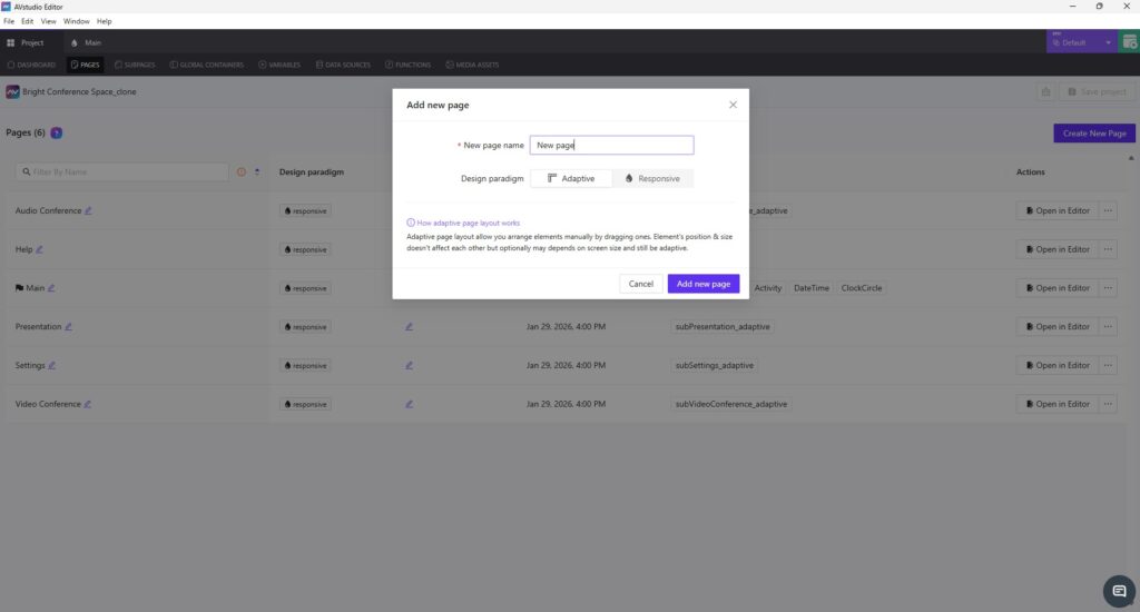
From the very beginning, AVstudio Editor was designed with the assumption that any interface built on the platform will need to exist on more than one screen. This is where Adaptive and Responsive page design comes in. These options allow layouts to adapt naturally to screen sizes, but they do so in different ways.
Adaptive pages use an absolute positioning model, where elements are placed using exact coordinates. This gives you very precise control over placement, while still allowing elements to behave predictably across varying screen sizes.
Responsive pages, on the other hand, use layout rules to dynamically scale and reposition elements based on screen size. Instead of manually defining coordinates, you create a single layout and let the system handle how elements are distributed as the resolution changes. This approach significantly reduces layout effort and is often ideal for supporting multiple devices with one design.
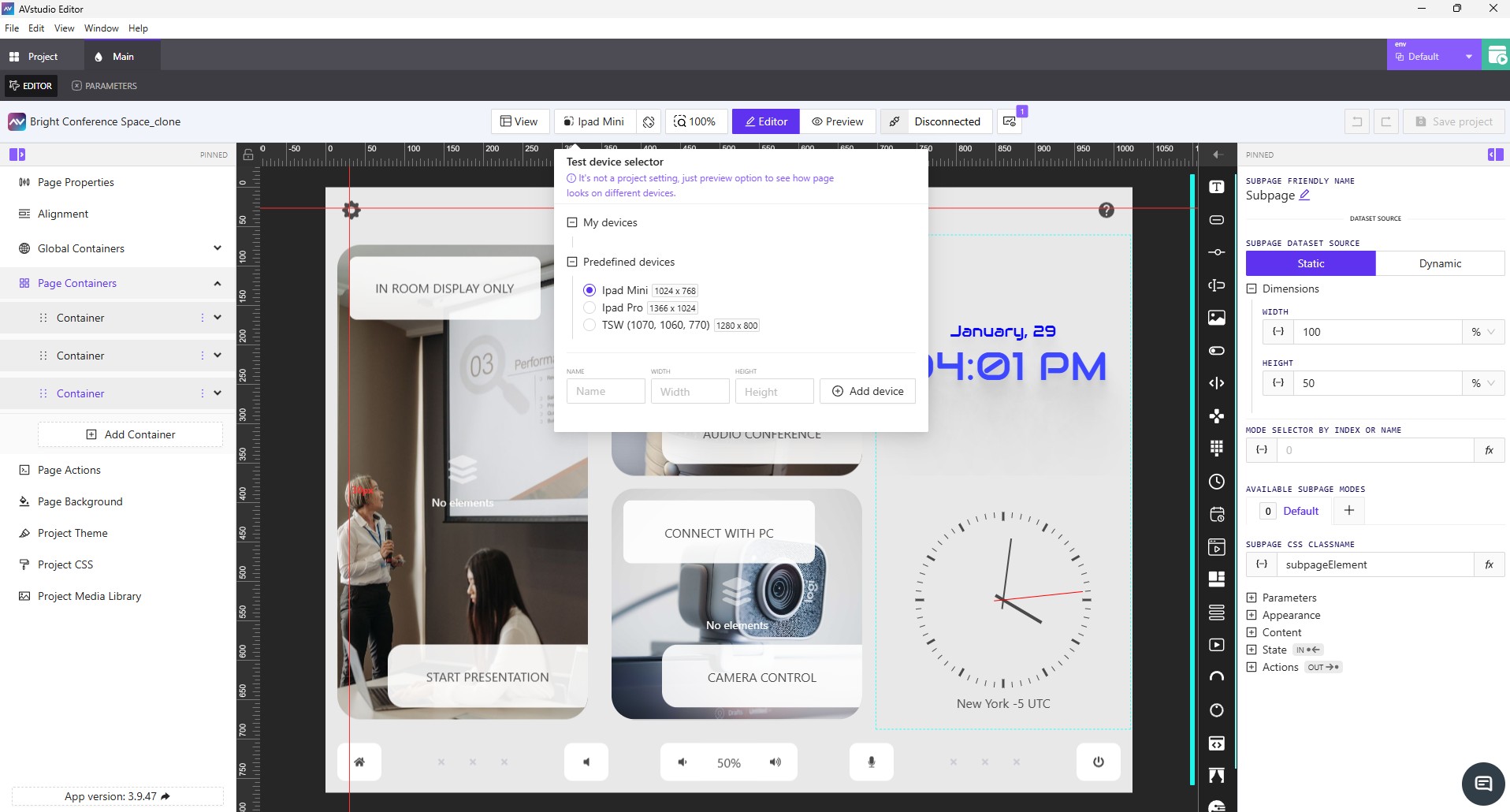
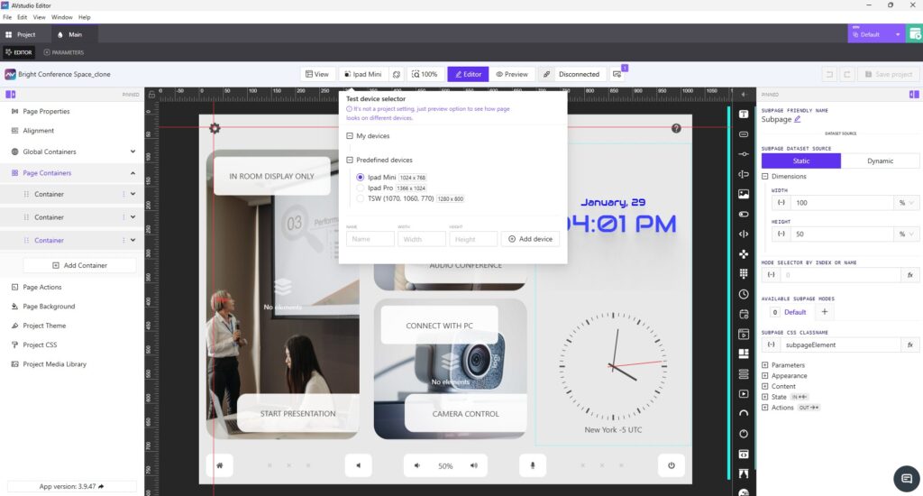
Live preview is another key feature in AVstudio Editor that helps solve this problem. It allows developers to immediately see how an interface looks and behaves across different screen sizes during the design process, without any extra hassle. This makes it easier to make informed decisions early and helps reduce surprises later, such as when an interface is deployed on a device that was not originally considered.
These solutions are not only effective for deploying a UI across multiple devices, but are also incredibly helpful when a project needs to scale beyond its original scope. Adding new elements or pages is straightforward and doesn’t require an overhaul of the original design. Instead, you can simply build on what already exists, making AVstudio Editor ideal for scalability.
Designing HTML5 user interfaces for multiple screen sizes is no longer an exception in the industry. It’s a norm. As user expectations continue to evolve, developers and integrators need tools that offer the necessary flexibility. Traditional UI editors are increasingly struggling to keep up with these demands. AVstudio Editor was built by developers, for developers, to address these challenges directly. By reducing the need for repetitive page duplication and layout maintenance, teams can spend more time creating interfaces that are consistent, flexible, and ready to evolve alongside the industry.
AVstudio Editor is built to support secure and safe system interaction. This ensures a high level of consistency and reliability across all devices. If you’re looking to speed up the design process for HTML5 user interfaces that need to work across multiple screen sizes, AVstudio Editor is worth your time. Try it for free today!
InfoComm 2026 Registration Is Now Open - Join AVstudio
Registration has officially opened for InfoComm 2026 in Las Vegas, and AVstudio invites you to experience our most ambitious showcase yet. From June 13-19, AVstudio will be located in Central Hall at Booth C5715. Feel free to stop by and talk with the team behind AVstudio Editor. We’ll be highlighting the latest updates, showcasing new ...
AVstudio Partners with NETIO for ISE Expo 2026
ISE Expo 2026 is almost here, and we’ve partnered with NETIO to deliver something special. At the event, the NETIO team will use an AVstudio template to demonstrate their products on the show floor. This collaboration showcases how efficient user interface design and reliable power control come together in a real-world environment, elevating the way ...